Your Cart is Empty

By the time I left the corporate world in 2016, I'd been thinking of starting a business for ten years.
I finally found myself with the time I needed to nail down the perfect concept. During the 6 months that followed, we analysed the market, I went on various business planning and e-commerce courses and trips throughout Europe, South Korea and Japan in search of potential suppliers.
The overall concept pretty much defined itself organically, from the moment we met The Superior Labor and Designphil (Traveler's Company) in Japan. Things went quickly (relatively speaking, considering that we had to set up a company legally, purchase inventory, set up the e-commerce platform, etc.) after that.
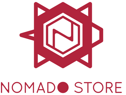
From my marketing background, I understood the importance of corporate branding, especially when launching a new company. We were convinced that our logo would be our key branding element, the challenge would be to translate our very much niche strategy into a unique symbol.
Typically, logos should be:
We also wanted ours to reflect the fusion of modern life, craftsmanship and tradition that Nomado Store is all about. Our search took us all the way to Berlin (Germany), a city with which we have strong personal and professional connections, to meet Asami Fujita, the perfect graphic designer for Nomado Store.
Fujita-san is Japanese and based in one of Europe's most creative cities. She uses high tech tools to design logos and patterns, but also makes objects by hand. This combination of technology, Japanese culture and creativity (she also loves to travel, just like us!) are exactly in line with the Nomado Store concept.
She liked our idea of using the turtle as a basis and imagined it as travelling "from handmade to high-tech". This is exactly the process she followed to design the logo. the first step was to make an origami turtle, a handmade object that looks simple but is quite complex (see second pic)


The second step was to choose a generic geometric shape to add structure. The hexagon used in Japanese Kikko Moyo (turtle shell) patterns was a self-explanatory choice.


Finally, we selected a font for the logo text and the "N" symbol in the hexagon and a colour.

We chose a Japanese red colour reference on a white background to maintain the symbolism and also because it is eye-catching. In Japan, the combination of red and white (kouhaku) is a symbol for auspicious or happy occasions. The turtle is also a symbol of long life and good luck, which makes the logo doubly auspicious! To us, the turtle also symbolises travel, portability and feeling comfortable when on the move.
As defined above, our logo is flexible and we have used it on various supports ranging from stamps and business cards (our first prototype logo on this one), through marketing materials, to products:


High Meadows x Nomado Store Leather TN Inserts

and finally, our new "Lucky Turtle Pins":

We'll be announcing lots of exclusive new Nomado Store products over the coming months, so watch this space!